


Ranking all 32 NFL uniforms for 2017 from worst to first
The game of football is fun to watch for many reasons, including the aesthetics of the teams jerseys. Here we rank all 32 NFL uniforms.
It's no secret that the NFL is a straight entertainment business. The giant brand they have built transcends the play on the field and attracts us all to it for various reasons. One reason for many is the look of the NFL uniforms. The appeal goes beyond the normal look of a team as many are interested in seeing what their team will wear in terms of alternate jerseys as well as the newly introduced color rush jerseys.
From the time the schedule is announced teams often include what jersey will be worn. Teams like the Houston Texans have their "Battle Red Day" jerseys. On this day, the team wears their full red on red look which fans tend to enjoy. There's also the throwback looks on special days like Thanksgiving. Although that's now ruined thanks to the NFL's rule on only using one helmet (which makes no sense because a player changing teams can wear a different helmet and they don't complain then).
Hopefully the Detroit Lions will start honoring that tradition again as they've recently modeled a new look to their uniforms which include the all-silver helmet throwback. It would surely be good to have the old school Turkey Day duds on the field again for at least one of the regular participants.
While discussing the topic of NFL uniforms, we attempt to rank them all from worst to first, taking a look at just the standard team jersey's rather than any alternate looks.
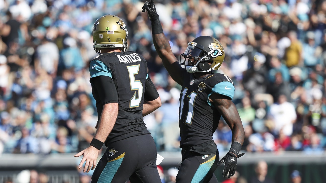
Dec 24, 2016; Jacksonville, FL, USA; Jacksonville Jaguars wide receiver Marqise Lee (11) celebrates after scoring a touchdown with quarterback Blake Bortles (5) in the first quarter against the Tennessee Titans at EverBank Field. Mandatory Credit: Logan Bowles-USA TODAY Sports
32. Jacksonville Jaguars
The color scheme of the Jacksonville Jaguars is actually pretty cool. In all honesty they seemed to make a genuine effort at a good NFL uniform. The problem is they just kept messing with it too much. For a franchise so young, they have yet to really establish an identity in terms of how they look on the field.
More from NFL Spin Zone
What really sells this apart as the worst uniform though isn't the odd placement of the stripe on the pants. It also isn't the weird dash of gold and teal on the white pants, or gold and white on the black. What makes this one so bad is the two-tone helmet.
The Jaguars helmet looks incomplete rather than different by design. It resembles a chocolate ice cream cone that was half-dipped in a caramel coating. The look would have been much better had they ditched the gold all together and just stuck with a black helmet.
As it stands now, the designers just tried to hard to incorporate all the colors. Sticking with a black and teal scheme would have been much better. Also, simply using the gold to accent the numbers would have gone much further than trying to dab a little of it here and there. Sadly, with as often as they've changed uniforms, there may be a desire to stick with this one a little too long just to avoid even more change.
Dec 11, 2016; Tampa, FL, USA; Tampa Bay Buccaneers cornerback Vernon Hargreaves (28) celebrates after intercepting the ball against the New Orleans Saints during the first half at Raymond James Stadium. Mandatory Credit: Kim Klement-USA TODAY Sports
31. Tampa Bay Buccaneers
Have you ever gone to type something into a Microsoft Word document only to find out that the font was about four sizes too big? That's exactly what it looks like happened to the logo on the Tampa Bay Buccaneers helmet.
The franchise decided a couple seasons back that they needed a refreshed new look. They got a lot of it right. The uniform itself mixes the colors pretty well and their new number design is actually pretty cool.
The problem is, it all goes to Hades when you look at the ridiculous logo on the helmet. It's something cartoonish that an Arena Football League team would even laugh at.
Outside of the logo, the designers also relied a little too much on the grey. Like the Jags before, it would have been nice to make it more of an accent color rather than so dominate. An example to prove this is how much better the all-red Color Rush uniform looks when compared to the red and grey one they trot out at most home games.
Of course, a return to the old cream-orange uniforms would be nice too. While at the time they were completely terrible, those ones have become a vintage look anyone can enjoy.
Nov 27, 2016; Cleveland, OH, USA; Cleveland Browns running back Duke Johnson (29) during the fourth quarter between the Cleveland Browns and the New York Giants at FirstEnergy Stadium. The Giants won 27-13. Mandatory Credit: Scott R. Galvin-USA TODAY Sports
30. Cleveland Browns
The Cleveland Browns needed a makeover. They had the most boring NFL uniform possible. Heck, not just the uniform was boring, but so is their name — it's simply a color. And the worst part is their logo and helmet is also simply a plain color. The problem is, those colors don't even match.
Then just before the 2015 season the Browns teased fans with their new uniform and logo. Immediately it became a joke as the logo was the same, but a different shade of orange. Then the new jerseys were displayed and everyone wished they would have just gone with a new shade there as well.
Cleveland decided their plain look needed some wording, just not on the helmet. Instead they kept the plain orange helmet and added the word "Cleveland" to the jersey. They also added some new looks which included an atrocious orange jersey on top of brown pants or possibly worse is the brown on orange combination.
No one knows why so much orange has been incorporated on a Browns team. Also escaping many is why the team thinks the colors blend so well, because they don't. The only way these combinations work is when they go orange jersey on white pants, or brown on white. They have to stop blending the others right away.
Dec 15, 2013; St. Louis, MO, USA; St. Louis Rams defensive end Robert Quinn (94) celebrates after causing and recovering a fumble by New Orleans Saints quarterback Drew Brees (not pictured) during the second half at the Edward Jones Dome. The Rams defeated the Saints 27-16. Mandatory Credit: Jeff Curry-USA TODAY Sports
29. Los Angeles Rams
When the Rams moved from St. Louis to Los Angeles they missed a golden opportunity to ditch the gold. They returned to their old stomping grounds in Southern California, but kept the blue and gold that was so symbolic of their time in St. Louis.
Once they returned to their roots, they needed to do the same thing with their jerseys. The blue and yellow is what anyone who remembers the Los Angeles Rams thinks of when they think of their team. The gold — not so much.
Not only would it have been nostalgic to return to their old duds, but it would have simply looked better. There's nothing fun or flashy about the current color scheme. The team knows this as they didn't sport either of their official shades during the NFL's Color Rush game. Instead, they went with an all-yellow suit that turned heads. Their normal look doesn't turn anything.
Although the one good thing that can be said is at least the uniform isn't as bad as their play on the field was in 2016. The Rams finished 4-12 last year — including an 0-7 performance with first overall pick Jared Goff starting at quarterback. Maybe this season will be better, but as of now the uniform still won't.
Dec 24, 2016; Seattle, WA, USA; Arizona Cardinals running back David Johnson (31) rushes against the Seattle Seahawks during the first quarter at CenturyLink Field. Mandatory Credit: Joe Nicholson-USA TODAY Sports
28. Arizona Cardinals
The Arizona Cardinals have one of the longest histories in all the NFL. They began way back in 1920 as the Chicago Cardinals, spent a season merged with the Pittsburgh Steelers in 1944, and then left Chicago for good in 1960 when they became the St. Louis Cardinals. They spent 28 seasons with the same name as the baseball team before moving to the desert to become the Phoenix Cardinals.
In 1994 they decided Arizona Cardinals sounded better and that's what they've been known as since. During the majority of their moving from St. Louis to 2004 their uniform stayed pretty bland. They also featured a logo that was called a "parakeet" by fans, and their owner Bill Bidwell decided to make a tougher looking bird to grace their helmet with a 2005 uniform re-design.
They also messed with the design of their uniforms and went with the new age look that was so popular at the time. Back then it looked alright, but now it's out of place and has an arena league feel.
The problem is there's too much going on, especially with their white uniforms. This one has a red stripe going down each side of the jersey which follows through to their leg. It also goes to the shoulders and across the back, which makes this uniform look more red than white. It's probably time to tweak it all over again.
Nov 13, 2016; San Diego, CA, USA; San Diego Chargers tackle King Dunlap (77) and defensive end Joey Bosa (99) embrace before the game against the Miami Dolphins at Qualcomm Stadium. Mandatory Credit: Orlando Ramirez-USA TODAY Sports
27. Los Angeles Chargers
The Los Angeles Chargers did almost as poor of a job moving to L.A. as the Rams did. While the Rams failed to return to their old school look during their early days in Southern California, the Chargers created a highly mocked new logo which caused them more grief than those who questioned the Rams sticking with the gold.
It looked like all they did was take the Los Angeles Dodgers "L.A." logo and add a lightning bolt to the "L." Of course the internet had fun with this, including this beauty shared by @RachelLBrown0:
@Faulconer4Mayor – hit the nail on the head with the @Chargers new logo @SDPartnership pic.twitter.com/0OXt1sKkcN
— Rachael Brown (@RachaelLBrown0) March 3, 2017
The logo wasn't their only mistake (though they corrected that by quickly retiring the widely panned new insignia), but so was sticking with their same boring look. The Chargers uniform isn't great, and it feels almost minor league when they are next to a different team. The shade of blue isn't appealing and the yellow on the bolt just doesn't flow with it.
What does flow, is the lighter blue of their alternate jersey with the yellow lightning bolts. Now if the Chargers were smart, they would have made this their primary jersey when they moved to Los Angeles.
Not only does it look better, but the fans like it more. It's common to see the baby blue cover the stadium and a simple internet search for Chargers jerseys for sale will bring up way more of their alternate look than their standard one.
Feb 5, 2017; Houston, TX, USA; New England quarterback Tom Brady (12) scrambles against the Atlanta Falcons during the first quarter of Super Bowl LI at NRG Stadium. Mandatory Credit: Matthew Emmons-USA TODAY Sports
26. New England Patriots
They may very well be the best team ever by the time quarterback Tom Brady hangs up his cleats. They've won five Super Bowls while appearing in seven total since he and Bill Belichick started working together. They've set tons of records and have looked amazing as a team.
The problem is they don't look amazing while playing to near-perfection. Their uniforms are not appealing whatsoever and they rely way too heavily on the dark blue in their take on the patriotic red, white and blue. On top of that, the logo itself is simply ugly.
Like a few of the teams mentioned before them, the Patriots could stand to use a little trip in Marty McFly's DeLorean. Their best years aesthetic-wise were the "Pat-Patriot" days. Not only was the white helmet cleaner looking, but the Patriot snapping the football was awesome. The rest of the look was far superior as well. The red uniform felt more patriotic than the deep shade of blue they wear now.
Also similar to some of the aforementioned teams, fans seem to love the look. When the Patriots used to be able to switch to these as alternate jerseys (before the league banned teams from alternate helmets) fans embraced the look fully. It's probably time to go back.
Nov 13, 2016; Nashville, TN, USA; Tennessee Titans quarterback Marcus Mariota (8) runs for a short gain during the second half against the Green Bay Packers at Nissan Stadium. The Titans won 47-25. Mandatory Credit: Christopher Hanewinckel-USA TODAY Sports
25. Tennessee Titans
Here we have the Tennessee Titans who really need to look at changing their uniform. Their sword logo is oddly similar to that of a generic team logo option given when relocating your team in EA Sports Madden NFL. The uniform design is kind of like that too as they seemed to just pick two colors and blot them on to the uniform in a pre-designed space.
To make it even worse the two colors they chose seem to be blue and blue-er. Neither shade of blue is bad, but they really don't go together very well. To make matters worse they also wear dark blue pants as well to just reinforce the fact that they really, really love the color blue. Then this past season they brought out their baby blue color rush uniform, which just looked like their alternate blue jersey with their road pants.
They're becoming a really fun team to watch with the addition of quarterback Marcus Mariota and running backs DeMarco Murray and Derrick Henry. They now are one of the more feared rushing offenses in the NFL and a few pieces away from being able to really become a serious contender.
Maybe it's time they become easier on the eyes as well. A complete makeover of their logo and jersey would go a long way towards doing just that.
Oct 30, 2016; London, United Kingdom; Cincinnati Bengals wide receiver A.J. Green (18) is defended by Washington Redskins cornerback Josh Norman (24) in the second quarter during game 17 of the NFL International Series at Wembley Stadium. Mandatory Credit: Kirby Lee-USA TODAY Sports
24. Cincinnati Bengals
The Cincinnati Bengals uniforms are so bad that they almost start to look good. Well — almost. Their striped helmet has become a bit of a laughing matter but rather than change it the Bengals actually added it to more places on the uniform. They now have stripes on their shoulders as well as down the sides of their pants.
They've gone full-blown Tony the Tiger and it really isn't a good look. What's even worse is when they wear their alternate orange jersey which looks like a bad attempt at dressing like a tiger on Halloween.
Of course the belief is owner Mike Brown is incredibly cheap. That may mean there's no hope of this look changing while he's in office, because he would probably have to hire a designer.
Now credit should be given where it is due. Their former uniform was actually much worse. Their design from the 1960s through 1980 looked like the Browns uniform with a black jersey instead of Brown. The only other difference was the word "Bengals" written across the orange helmet. This comes as no surprise because Mike Brown learned being cheap from his father Paul Brown who founded the Bengals. The elder Brown actually used some old Browns equipment once he was fired by Cleveland and then co-founded the Bengals. Yes, really.
In 1981 they ditched the stolen Browns gear and went with the Tiger stripes. It's time to head back to the drawing board.
Dec 11, 2016; Los Angeles, CA, USA; Atlanta Falcons outside linebacker Vic Beasley (44) is greeted by Atlanta Falcons defensive tackle Grady Jarrett (97) after he scored on a 21-yard fumble recovery in the third quarter of the game against the Los Angeles Rams at Los Angeles Memorial Coliseum. Mandatory Credit: Jayne Kamin-Oncea-USA TODAY Sports
23. Atlanta Falcons
Sometimes you just need to leave well enough alone. The Atlanta Falcons were all about the red uniforms with just a touch of black since joining the league in the 1970's until the 1990 season when they decided to go all black. This style was sleek, clean and fun to watch.
They were never a dominate team, but seeing a Hall of Fame player like cornerback Deion Sanders do his "Prime Time" strut in this jersey was a joy to watch. Then in 2003 things changed. They decided to make red the featured color again and they tweaked the Falcon on the helmet to resemble the letter F. Or maybe it was to resemble the grade they deserved for the re-boot.
The new look is reminiscent of what the Arizona Cardinals did with theirs, which is they tried too hard to make drastic changes when subtlety is the key. The red and white just isn't as good of a look and the way they splash in the three colors on their sleeves just doesn't look right.
To highlight their mistake, just look back to their throwback jersey they wore during the 2016 season, which were simply awesome.
The Atlanta Falcons have mashed up two eras with their "blended" throwback uniforms https://t.co/Ln8yxvYtck pic.twitter.com/OVtW0dzcMu
— Chris Creamer (@sportslogosnet) October 19, 2016
Atlanta can do themselves some favors and switch to that one permanently. Until they do, they'll be hanging out in the back end of these standings.
Dec 11, 2016; Charlotte, NC, USA; Carolina Panthers quarterback Cam Newton (1) with the ball as San Diego Chargers outside linebacker Kyle Emanuel (51) defends in the third quarter at Bank of America Stadium. Mandatory Credit: Bob Donnan-USA TODAY Sports
22. Carolina Panthers
You have to give it to the Carolina Panthers for consistency. Since joining the NFL in 1995 they've had a nearly identical look. While their logo has been somewhat altered, their uniforms have not. For that reason, they get praise because at least they have a strong identity unlike the Jaguars who joined the league the same year and seem to have new look every three-to-four seasons.
However, it may be time for a change. The Panthers current uniform isn't necessarily bad and their color scheme is pretty cool. They have their black and what is called "process blue" which is very similar to the North Carolina Tar Heels. They also throw in a little silver as an accent color, all of which works together pretty nicely.
It just isn't the best uniform. Having it look exactly the same for so long works for some teams — including many in our top ranks which may be a bit of a spoiler — but that's only because they nailed their look. The Panthers haven't exactly done that yet. Of course the good news is they have the correct tone and all, so a massive overhaul isn't necessary. Just a little clean up is all.
Jan 1, 2017; Denver, CO, USA; Denver Broncos outside linebacker Von Miller (58) in the third quarter against the Oakland Raiders at Sports Authority Field at Mile High. Mandatory Credit: Isaiah J. Downing-USA TODAY Sports
21. Denver Broncos
Not like the Denver Broncos old uniform was great or anything, but their 1997 alteration was a bit much. In their John Elway days they were known for their mix of royal blue and orange. It was a much appreciated look in 1968 considering the uniform before it was one of the ugliest combination of yellow and brown ever. The revamped look was a white and orange uniform with the blue helmet. A logo of a bucking Bronco inside the letter "D" graced the helmet and it was okay, but not great.
Then in 1997, things changed. The Broncos went all 90s on their uniform and ditched the royal blue for a darker navy version instead. They also decided to go with blue jerseys as a primary option as opposed to the orange. Then, of course, they put a terrible stripe down the sides of their jerseys and pants to get as much color contrast as possible.
The only things saving them now is that they ditched the blue as a primary jersey over the past few years and returned to the orange. Also, the logo was changed to be a horse's head in a profile artistic design rather than the bucking horse inside a giant letter.
Dec 11, 2016; Santa Clara, CA, USA; New York Jets defensive tackle Leonard Williams (92) celebrates with defensive end Sheldon Richardson (91) after Richardson's tackle against the San Francisco 49ers during the fourth quarter at Levi's Stadium. The New York Jets defeated the San Francisco 49ers 23-17. Mandatory Credit: Kelley L Cox-USA TODAY Sports
20. New York Jets
Maybe it isn't so much the design of the New York Jets logo that stinks as it is their lack of options. While most teams have a third color in their wheel house to break up the monotony, Gang Green just relies on good 'ol white and green. That's it. While they deserve some credit for that and for not changing to make others happy, it would be nice to see something slightly different.
Instead what we get is green shirts with white sleeves, or a white shirt with green sleeves. They also have green pants with a white stripe down the sides that they can wear whenever they get tired of their white pants with a green stripe down the side.
Really what the New York Jets are is that one friend we all have who isn't a terrible dresser, but wears the same exact thing. Even when that friend changes it's still the same thing just in reverse. It's like he went to Kohl's and bought every different option of the same shirt on clearance. Except the Jets just bought up all the green ones and then they put them on and go play really, really bad football.
Jan 7, 2017; Houston, TX, USA; Houston Texans defensive end Jadeveon Clowney (90) in action against the Oakland Raiders during the AFC Wild Card playoff football game at NRG Stadium. Mandatory Credit: Jerome Miron-USA TODAY Sports
19. Houston Texans
The Houston Texans were a blessing as the Tennessee Titans deserted this fun football town following the1996 season. Back then they were the Houston Oilers and anyone who grew up watching quarterback Warren Moon play for them has to agree that franchise should have stayed.
That's no knock on the Texans as they seem to be headed in the right direction, should they ever get a real quarterback that is. The only problem with them is they just feel so generic. Their name is generic as it describes a collection of people in a state rather than an actual team name and their helmet and logo is the same as it's just a bull with a lone star on it. Such basic Texas, right?
Then they play on the down to earth American Texan theme with the red, white and blue color scheme. None of it of course is bad, but like their play on offense it really isn't very good. This is a team that could stand for some change. Houston Sports Talk 790 had a great idea for them which included going after the Oilers routes with their color scheme.
Could the Texans "color rush" uniforms for next season be Oiler Blue? https://t.co/ndxaSoKdgR pic.twitter.com/rtPCW9FaMi
— SportsTalk 790 (@SportsTalk790) April 18, 2016
While this look would be amazing, the current Texans brass may be trying to create their own Houston sports roots. However, there's nothing wrong with tweaking your own blue just a little to tug at the heartstrings of your beloved fans.
Sep 18, 2016; Denver, CO, USA; Indianapolis Colts quarterback Andrew Luck (12) in the third quarter against the Denver Broncos at Sports Authority Field at Mile High. Mandatory Credit: Isaiah J. Downing-USA TODAY Sports
18. Indianapolis Colts
Some teams keep it simple with their uniform and it works, whereas some teams keep it simple and it just seems blah. The Indianapolis Colts feel somewhere in-between, but they straddle closer to the blah than the working stage. The problem isn't their blue and white color scheme, but just their incredibly boring logo.
Since they joined the football world as the Baltimore Colts, this team featured the same colors and the same bland horseshoe logo has graced their helmet since their second season in the league. That's pretty much been it. Sure, a stripe was added here or there, but the overall look has been unchanged for decades.
The one thing that saves them from being the most boring franchise in the world is their ability to land amazing quarterbacks. This Colts hit a home run once with Johnny Unitas. The Hall of Fame passer was the face of the franchise from 1956-72. After that, they found Peyton Manning who is arguably one of the top two or three to ever play the game and will surely be a Hall of Fame member as well once eligible.
Manning was in a Colts jersey from 1998 until they found Andrew Luck in 2012. He is now on his way to an exceptional NFL career. Too bad he has to do it in a boring uniform.
Jan 1, 2017; Philadelphia, PA, USA; Philadelphia Eagles quarterback Carson Wentz (11) passes against the Dallas Cowboys during the second quarter at Lincoln Financial Field. Mandatory Credit: Bill Streicher-USA TODAY Sports
17. Philadelphia Eagles
Well, at least it's not the nasty yellow and blue uniform. In 2007 they rolled out this atrocity of a uniform as an alternate option. Outside of that it has been green, white and a hint of silver.
The Eagles for ages used the light shade of Kelly green and they were the second team in the league to ever put a logo on their helmet. The problem is the logo is kind of ugly. Just a pair of wings oddly placed on either side of the head.
Although the log was only so-so, the shade of green was fantastic. It looked great especially when they had a highlight reel of a quarterback like Randal Cunningham making defenses look silly trying to catch him.
Then in the late 1990s they switched to a darker green, which really doesn't look as good. Just to make matters even worse they like to throw out an occasional black alternate jersey, which just doesn't fit with their style at all.
Maybe the powers that be will decide it's time to return to their roots. New head coach Doug Pederson has qualities about him that make the Eagles feel like they're on the right path. Going back to their old look would be an even better move.
Jan 1, 2017; Detroit, MI, USA; Detroit Lions wide receiver T.J. Jones (13) runs with the ball before the game against the Green Bay Packers at Ford Field. Packers won 31-24. Mandatory Credit: Raj Mehta-USA TODAY Sports
16. Detroit Lions
The Detroit Lions do a lot of things they shouldn't do. They draft people like Michigan State receiver Charles Rogers with the second overall pick only to watch him play 15 career games. They also hire coaches like Jim Caldwell who have a history of making in-game blunders, especially when it comes to clock management.
Then they do even worse things like stop wearing their throwback jersey's on Thanksgiving Day. For years it had become common place to see the Lions wearing their blue jerseys with silver pants and solid silver helmet. Then they killed the tradition and began wearing their boring old normal uniforms.
However, the good news is, it seems like they are bringing the throwback jerseys into the mix again. The Lions recently announced they are changing their uniforms, even though there was nothing wrong with what they had.
The color scheme is the same with the Honolulu blue, silver and white. They have switched a few things up though including an all-grey alternate jersey and a twist on the throwback.
One thing they shouldn't have done, though, is switch out the white and silver combination for their light colored jersey for a white shirt with blue pants. That may be the one thing to mess this look up.
Nov 20, 2016; Arlington, TX, USA; Baltimore Ravens wide receiver Steve Smith (89) runs after a catch against Dallas Cowboys linebacker Anthony Hitchens (59) at AT&T Stadium. Mandatory Credit: Matthew Emmons-USA TODAY Sports
15. Baltimore Ravens
In 1996 the Baltimore Ravens franchise got a lot of things right. They moved out of Cleveland where they had some serious bad luck as the Browns organization. Owner Art Modell set them up with a new him in the city of Baltimore and they became the Baltimore Ravens.
He also did the league a pretty solid favor in leaving the history of the Browns with the good people of Cleveland. This allowed them to bring their team back and not wind up with something like the Cleveland Ohioans — like what happened when the Houston Oilers history traveled to Tennessee with the Titans.
On top of doing right by the league, Modell did right by Baltimore fans. He gave the Ravens a unique look that stayed strong till this day. The purple and black are found only on their uniform and to make sure those colors pop they throw in some gold around the raven logo and the numbers.
Another nice touch is the crest on the shoulders which combines the Baltimore city crest with the Ravens logo. The team could stand to tweak their all-black alternate some, as the pants used with these don't fit the NFL-norm. Outside of that, they're a solid looking team with their current style.
Jan 8, 2017; Pittsburgh, PA, USA; Pittsburgh Steelers wide receiver Antonio Brown (84) celebrates with Steelers running back Le'Veon Bell (26) after scoring a touchdown against the Miami Dolphins in the AFC Wild Card playoff football game at Heinz Field. Mandatory Credit: Geoff Burke-USA TODAY Sports
14. Pittsburgh Steelers
It's funny to find out that the Pittsburgh Steelers having just one logo on their helmet happened because the team wasn't sure they would like the logo at all. According to the website, Steel.org, the team wasn't sure how the logo would look on their helmets, which were gold at the time, so they put it on just one side as a test:
At first, this was a temporary measure because the Steelers weren't sure they would like the look of the logo on an all-gold helmet. They wanted to test them before going all-out.
Equipment manager back then, Jack Hart, was instructed to put the logo only on one side of the helmet—the right side. The 1962 Steelers finished with a 9-5 mark and became the team with the most wins in franchise history to date. The team finished second in the Eastern Conference and qualified for the Playoffs. They wanted to do something special for their first postseason game, so they changed the color of their helmets from gold to black, which helped to highlight the new logo.
Because of the interest generated by having the logo on only one side of their helmets and also due to the team's continued success, the Steelers decided to leave the helmet that way permanently. Today's helmet reflects the way the logo was originally applied and it has never been changed.
The rest, of course, is history and the Steelers have an iconic look. It's not good enough for top 10, but it gets them close. The black and yellow of Pittsburgh's football team is incredibly recognizable and they've done a great job marketing their look.
Jan 15, 2017; Arlington, TX, USA; Green Bay Packers quarterback Aaron Rodgers (12) hands off the ball to fullback Aaron Ripkowski (22) against the Dallas Cowboys in the NFC Divisional playoff game at AT&T Stadium. Mandatory Credit: Matthew Emmons-USA TODAY Sports
13. Green Bay Packers
Another team known for their bright yellow finds their way into the top 15. The Green Bay Packers are much like the Pittsburgh Steelers who finished just ahead of them in that they have an iconic look.
The white "G" that is circled in green and outlined in yellow is as recognizable as they come, and it's somewhat of a trend setter. In the 1960s, the Georgia Bulldogs coach Vince Dooley wanted to re-tool his team's look. He was able to get the permission of the Packers to use the design, which of course was done in Georgia's red and black. They weren't the only college to use this design as shortly after the Bulldogs used it, so too did Grambling State.
With two colleges asking to use your design, you know you got it right. That's why the logo looks almost identical today to what it looked like in the 1960s. The lone difference being a yellow highlight outside the oval.
The Packers are a fantastic franchise that is always relevant despite playing in a small market and being owned by a city rather than a single billionaire. They're even located right outside a residential area rather than a bustling downtown. The Packers have become trendsetters by doing things their own way, and this is evident in their uniform as much as anywhere else.
Jan 1, 2017; Minneapolis, MN, USA; Minnesota Vikings cornerback Xavier Rhodes (29) intercepts a pass during the first quarter against the Chicago Bears at U.S. Bank Stadium. Mandatory Credit: Brace Hemmelgarn-USA TODAY Sports
12. Minnesota Vikings
The Minnesota Vikings fixed something that was incredibly broken in 2012. The jerseys they wore from 2006 until then were just ugly. They stayed with their purple, white and yellow look, but tried to get in on the different colored shoulder look that was becoming popular at the time. Unlike some of the teams that are on the wrong end of this ranking, Minnesota scrapped this.
The result was something much closer to their 1996-2005 look, which really had nothing wrong with it. They returned to a simple set of stripes down the pants and made the only color variance on the sleeves the yellow and white stripes on the purple on the purple jersey — and the yellow and purple on the white.
They also added a purple option for their pants on the road, which adds a different layer to their look. Really the one that gets them this high though is the purple on white. They did a great job of paying tribute to their old look while still redefining themselves amid the 2012 switch over to Nike supplied uniforms. Still, it would probably be cool to see a better color rush uniform besides the all purple, maybe something with a yellow jersey would be cool.
Dec 24, 2016; New Orleans, LA, USA; New Orleans Saints quarterback Drew Brees (9) gestures at the line against the Tampa Bay Buccaneers during the first quarter of a game at the Mercedes-Benz Superdome. Mandatory Credit: Derick E. Hingle-USA TODAY Sports
11. New Orleans Saints
Who dat? The New Orleans Saints have possibly the weirdest catch phrase in all of sports, but hey their fans love it and that's what counts. As for their style on the field what counts is this team slowly got away from what didn't work.
They've stuck true to their gold and black colors, but they've let the gold become much more of an accent color now with their black jersey. When the gold pants and black shirt were out together it wasn't anywhere near as good looking as when they would go to the alternate black pants with black jersey. Now that's become their signature look, and it is nice. The black pants also flow well with their white jerseys. Then of course the gold helmet with black Saint logo is as recognizable as any in the league.
Now the team is trying all they can to get back to their play on the field looking as good. Recently they've had three-straight 7-9 finishes despite veteran quarterback Drew Brees being a monster in terms of passing production. Perhaps some of their draft picks in 2017 on the defensive side of the ball will help them even things out, if not it could be a depressing end to one of the better careers for a quarterback in New Orleans history.
Dec 24, 2016; Chicago, IL, USA; Chicago Bears running back Jordan Howard (24) in action during the game against the Washington Redskins at Soldier Field. The Redskins defeat the Bears 41-21. Mandatory Credit: Jerome Miron-USA TODAY Sports
10. Chicago Bears
One of the more storied franchises in all the NFL is the Chicago Bears. This beloved football program started as a team in 1919, then joined the NFL the following season. They played back in the days when there were no logos, just leather hats. Then in the 1950s they sported a black bear before going with their signature "C" in 1962.
Originally white, this design has only changed in color, rather than anything else. They've also only had minimal changes to their jersey since then. The Bears have stuck with their navy blue uniform with white pants and orange "C" for the longest time. The only difference being flipping the color of shirt and pants on road and home games.
Now this doesn't mean they've never tried anything different. There was a year early in the 2000s where they tried an orange shirt. It just didn't work. The team wisely decided to switch back to their signature look.
Of course off the field they haven't looked near as good. They recently were mocked for their move up one spot in the 2017 NFL Draft to get quarterback Mitchell Trubisky. They also were poked fun at for shying away from big name school products from that point on.
Nov 6, 2016; East Rutherford, NJ, USA; New York Giants defensive end Jason Pierre-Paul (90) tackles Philadelphia Eagles quarterback Carson Wentz (11) during the first half at MetLife Stadium. Mandatory Credit: William Hauser-USA TODAY Sports
9. New York Giants
The New York Giants have a storied history dating all the way back to 1925. One of the earlier NFL teams, they've had several different looks while always managing to stay pretty consistent. There's been no massive overhauls of their uniform or logo, and the color scheme has always remained blue, silver and red.
Some of their earlier looks included a primarily red jersey with either white or silver pants and they've had a blue helmet for nearly their entire existence. The biggest changes to the modern NFL look they feature now is a switch from a helmet which used the logo "Giants" in all capital letters, to their current lower-case "NY."
The current helmet is much better. The abbreviated New York is a much more appealing logo than the full team nickname which looked kind of cramped on the helmet. The team was smart though when making the switch to this new look since the rest of the uniform was only tweaked moderately. The red stripes on the white jersey were kept, but the weird red and white stripes were scratched from the blue jerseys.
It all works incredibly well together and the let the dominant colors rule, while making sure the secondary ones are used sparingly.
Jan 15, 2017; Arlington, TX, USA; Dallas Cowboys quarterback Dak Prescott (4) celebrates his two point conversion in the fourth quarter against the Green Bay Packers in the NFC Divisional playoff game at AT&T Stadium. Mandatory Credit: Matthew Emmons-USA TODAY Sports
8. Dallas Cowboys
One of the most recognizable looks in the entire NFL is that of the Dallas Cowboys. They keep it simple with a blue, white and silver color scheme and a star as the logo. However, even simpler than that is the fact that they try all they can to shy away from wearing their blue jersey's.
Instead Dallas trots out their white jersey with the small touches of blue. It looks clean against the silver pants and helmet with the incredibly recognizable star on the helmet as the focal point.
Since their birth the Cowboys have featured the blue and white. Their old throwbacks included the blue jersey with a white patch on the shoulders to showcase their star. They flipped the colors for their white jersey and had a blue star on a white helmet. The biggest difference from then to now is just the switch to the silver helmet and pants as well as the dropping of the shoulder stars.
Thankfully for this franchise their play is finally starting to match their look. Something about seeing big name players like quarterback Dak Prescott, receiver Dez Bryant and running back Ezekiel Elliott playing well in the star just feels right. Love them or hate them, the league is more interesting when Dallas is good and their style is also easy on the eyes.
Dec 25, 2016; Kansas City, MO, USA; Kansas City Chiefs tight end Travis Kelce (87) runs after a catch as Denver Broncos free safety Darian Stewart (26) defends during the first half at Arrowhead Stadium. Mandatory Credit: Denny Medley-USA TODAY Sports
7. Kansas City Chiefs
There's been some changes over the years to the Kansas City Chiefs look, but wisely it's been very minimal. That even includes them moving from their original home in Dallas. For the first couple years of the 1960s, the Chiefs franchise was known as the Dallas Texans. This team's look consisted of a red and white uniform with a red helmet. On this red helmet was a white loge shaped like the state of Texas with a star on it where the city of Dallas was located.
The team relocated in 1963 to Kansas City and the only real change was the Texas logo becoming an arrowhead with a "KC" in it. The owner of the team at the time, Lamar Hunt, reportedly drew the logo on a napkin and was inspired by the design which graced the helmet of the popular San Francisco 49ers.
Fans love the look as it's clean and easily recognizable. They were incredibly wise as they kept it without complications thanks to the lack of alternate jerseys. Kansas City keeps it simple by allowing the red and white to dominate the jersey and using the third color, yellow, as a simple outliner on stripes, sleeves and around the numbers.
Nov 20, 2016; Landover, MD, USA; Washington Redskins quarterback Kirk Cousins (8) look of the line against the Green Bay Packers during the first half at FedEx Field. Mandatory Credit: Brad Mills-USA TODAY Sports
6. Washington Redskins
The Washington Redskins can't get much right as a franchise. Owner Dan Snyder is as tone deaf as they come and can't get out of his own way. He ignored the outcry of hate received about his team nickname and also has a history of meddling where he shouldn't.
He hires a talented person like head coach Mike Shanahan, who starts to make positive strides. Then he lets his ego convince him the positive momentum is his own, and tells a smart person like Shanahan to use an awful quarterback like Robert Griffin III. Then he fires him when said quarterback stinks it up on the field.
He then follows that up by hiring a good general manager in Scot McCloughan, only to fire him as well once the team starts to improve.
Despite his blunders with team building, Snyder has been wise about his brand. Washington has one of the more recognizable logos and color schemes in all of football. Their use of burgundy and gold are great together. They've also done a good job of staying true to themselves while tweaking any uniform. The best example was when they began to again use the gold pants in recent seasons. Smart move.
December 11, 2016; Santa Clara, CA, USA; San Francisco 49ers running back Carlos Hyde (28) during the second quarter against the New York Jets at Levi's Stadium. The Jets defeated the 49ers 23-17 in overtime. Mandatory Credit: Kyle Terada-USA TODAY Sports
5. San Francisco 49ers
Here's a team who has a signature look. The San Francisco 49ers were the stars of the 1980's and also most of the 1990's thanks to having back-to-back franchise quarterbacks. They were able to win Super Bowls with both Joe Montana and his successor Steve Young. Each of these guys are now in the Hall of Fame and both have a lot to do with how beloved the Niners are.
Part of what makes them so endearing, outside of their star signal-callers, is their powerful brand. The 49ers have been in the NFL since 1946 and although there have been some uniform changes, the general look has always been the same — gold and red. The Niners signature gold helmet with the "SF" logo has always been incredibly recognizable and their red home jerseys and white road duds both look great on their gold pants.
Now there have been a couple exceptions to the rule. San Francisco went a spell in the 1990s where they used some white pants with the red shirt and gold helmet. This looked pretty bad, and they wisely scrapped the idea quickly. Another bad one has been their black alternate which was not received well.
Both these examples reminded the guys in charge that they've had it right for years and should leave it alone.
Dec 11, 2016; Orchard Park, NY, USA; Buffalo Bills running back LeSean McCoy (25) runs with the ball during the second half against the Pittsburgh Steelers at New Era Field. The Steelers beat the Bills 27-20. Mandatory Credit: Kevin Hoffman-USA TODAY Sports
4. Buffalo Bills
Teams with bad uniforms need to call the Buffalo Bills for a little sit down. The Bills had a look that ran it's course with their blue and white uniforms and the bright red helmets. So they decided to tweak it some in 2002. The results were just awful.
They kept the unsightly red helmet and darkened the blue. Then they added the terrible shoulder and back stripe that is still nastily placed on the Cardinals white jerseys and both versions of the Titans. It was beyond ugly and in 2011 they decided to move on from it and return to their roots.
What the Bills did was paid attention to what the fans liked. Whenever they were wearing their throwback uniforms which included a softer blue and a white helmet, the fans loved it. So this served as an inspiration for their new look. They updated it all, but kept a similar shade of blue and used their current Bills logo of a running Buffalo rather than the red outline that graced their original white helmets.
After these tweaks the result was a clean looking uniform that is much easier on the eyes. The smartest thing about it all though is that it still frees them up to use that red Buffalo logo and go with the throw back.
Dec 20, 2015; Oakland, CA, USA; Oakland Raiders outside linebacker Khalil Mack (52) reacts to a penalty against the Raiders during action against the Green Bay Packers in the second quarter at O.co Coliseum. Mandatory Credit: Cary Edmondson-USA TODAY Sports
3. Oakland Raiders
Not many uniforms are as simple as the Oakland Raiders, but it sure works for them. Originally black, gold and white starting in 1960, the Raiders changed their colors to their current black and silver in 1963 when Al Davis took over control. They also added a logo to their helmet which is the same design we see today. The football helmet-wearing pirate has his eye patch and two cutlasses under him and the look is synonymous with Raider football.
To this day they still wear the silver pants and either white or black jerseys. They also have the same lettering and names on the back with no accent colors. While some teams doing this look bland and boring, it just fits with the Raiders.
The style is so good that there's been more changes to the team's location than uniform in their existence. Originally the Oakland Raiders, they moved to Los Angeles where they played from 1982-94.
In 1995 they returned to Oakland, but that won't last much longer. The franchise has recently struck an agreement to move to Las Vegas in either 2019 or 2020. There's also a rumor that they may need a temporary home as the city of Oakland isn't too thrilled at the prospect of losing their team.
Nov 6, 2016; Miami Gardens, FL, USA; Miami Dolphins running back Jay Ajayi (23) carries the ball against the New York Jets during the second half at Hard Rock Stadium. The Dolphins won 27-23. Mandatory Credit: Steve Mitchell-USA TODAY Sports
2. Miami Dolphins
Here's a team that was able to update their uniform without killing their overall look. From their inception in 1966 until 2012 the Miami Dolphins looked almost exactly the same. Their helmets were white with the jumping dolphin logo who also wore a white helmet himself. The combination of aqua and white jerseys with a hint of orange — like the sun around the jumping dolphin — worked in great cohesion.
Then shortly after Nike started providing the NFL uniforms, the Dolphins made a change. Prior to the 2013 season they unveiled a new look, which featured the same primary colors, but somehow it just looks much cleaner. The aqua now feels refreshed and the orange is more subtle, but somehow that makes it stand out just a little more.
Miami also vastly updated their logo. The cartoonish Dolphin was replaced with a more realistic version of the animal and his helmet was removed. They kept the orange sunburst — although it is also heavily revamped — but this time the Dolphin appears to swim in it rather than jump.
It all works together in perfect harmony as Miami incorporated the new feel of the modern Nike looks while staying true to their original team colors. They also were wise in keeping their white helmet as it allows them to pay homage to their past with a great throwback look as well where they can sport their original design.
January 7, 2017; Seattle, WA, USA; Seattle Seahawks quarterback Russell Wilson (3) moves out to pass against the Detroit Lions during the first half in the NFC Wild Card playoff football game at CenturyLink Field. Mandatory Credit: Steven Bisig-USA TODAY Sports
1. Seattle Seahawks
The Seattle Seahawks have only been in the NFL since 1976 and during that time they've had very little change to their look. From the 1970s until early 2000s they had a similar style with only slight updates. In 2002 they had their first drastic overhaul which centered around a much darker blue than the original look.
They tried incorporating some of their signature green (which was used in the stripes in their original uniform) in an alternate jersey, but nixed that after one showing. Then they decided to bring the green back as a focal point in their 2012 alteration.
Instead of simply throwing out a green alternate, the 'Hawks decided to go bold with a neon stripe down the side of their uniforms as well as a neon shoulder piece as well. The look isn't over the top as the designers were able to make the inclusion of the eye-popping color look neat.
As nice as it is against the blue, the green and white uniform may be even better. This look has the green as more of an accent color that highlights names and numbers. However once players put on matching gloves and shoes which feature the color it makes the often boring white uniforms a little more fun to watch.
2024 NFL Draft best bets and odds
2024 NFL Draft Schedule: Date, time, how to watch, TV channel
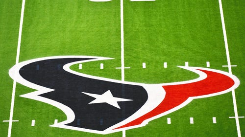
2024 New NFL uniforms: Texans unveil redesign, new secondary logo
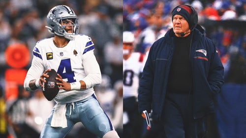
Could Dak Prescott and Bill Belichick team up in 2025 — on the Giants?
The Sum God: How Amon-Ra St. Brown’s record WR deal affects other star wideouts
Bears announce plans for new 'state-of-the-art' stadium near lakefront
5 Bold Predictions for 2024 NFL Draft: Texas DT Byron Murphy a top-10 pick
2024 NFL Draft odds: Chargers' odds to pick J.J. McCarthy rise on draft eve
Steelers reportedly not expected to pick up Justin Fields' fifth-year option
-
2024 NFL Draft best bets and odds
2024 NFL Draft Schedule: Date, time, how to watch, TV channel
2024 New NFL uniforms: Texans unveil redesign, new secondary logo
-
Could Dak Prescott and Bill Belichick team up in 2025 — on the Giants?
The Sum God: How Amon-Ra St. Brown’s record WR deal affects other star wideouts
Bears announce plans for new 'state-of-the-art' stadium near lakefront
-
5 Bold Predictions for 2024 NFL Draft: Texas DT Byron Murphy a top-10 pick
2024 NFL Draft odds: Chargers' odds to pick J.J. McCarthy rise on draft eve
Steelers reportedly not expected to pick up Justin Fields' fifth-year option