


The Super Bowl logos are iconic, dating back to when the game was just getting started. Here are the top 30 ever created, starting with a classic contest.
30. Super Bowl III
There are reasons to both love and hate the logo for Super Bowl III. The colors, font, and simple prominence are worthy of being a top-10 logo. It’s so simple, it’s good. The designer was able to represent both the NFC and AFC with the colors, and created a good balance between the two. However, the excessive amount of stars ultimately ruins it for viewers.
Had the stars been on the outside of the letters the image might have looked much better, but ultimately they are too much in too little space. While it was the first championship game to bear the name Super Bowl, the logo doesn’t do the game justice.
28 Jan 1990: A general view of the half time festivities during the 49ers 55-10 victory over the Denver Broncos in Super Bowl XXIV at the Louisiana Superdome in New Orleans, LA. (Photo by Icon Sportswire)
29. Super Bowl XXIV
Simple red, white, and blue carries the Super Bowl XXIV logo into the top-30 rankings. Before the intricate designs appeared on Super Bowl logos, the NFL went with some well rounded features for the big game. The roman numerals are large and prominent in the middle, and almost look like they’re on a ticket. The words Super Bowl are hardly hidden as they wrap around the corners on a ribbon. It’s simple, yet gets the job done. You can not ask for much else in this type of design.

Washington Redskins quarterback Billy Kilmer awaits the snap in a 14-7 loss to the Miami Dolphins in Super Bowl VII on January 14, 1973 at Los Angeles Memorial Coliseum. (Photo by James Flores/Getty Images) *** Local Caption ***
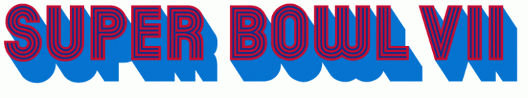
28. Super Bowl VII
When you think of television in the 1970’s you get these bold letters that look to be flying off the screen. That’s exactly what the logo for Super Bowl VII did when the Dolphins beat the Redskins 14-7, despite not scoring in the second half.
Once again, the simple red and blue are featured as the letters explode off the screen. While the old logos do not fully represent the host city, this one gets the job done. I’m sure the zooming animation made by the logo on TV was just as good.
Football: Super Bowl XIII: Pittsburgh Steelers Franco Harris (32) victorious with ball and teammates Gerry Mullins (72) and Ray Pinney (74) after touchdown vs Dallas Cowboys. Miami, FL 1/21/1979 CREDIT: Tony Tomsic (Photo by Tony Tomsic /Sports Illustrated/Getty Images) (Set Number: X23081 TK2 )
27. Super Bowl XIII
Another quintessential 70’s design comes in at No. 27 on our rankings. There’s a good balance between the red and blue once again, and the font is just the right size. The dots that make up the large roman numerals remind you of so many things. People see them as Pac-Man points, seats in Congress, or maybe an intricate game of pong.
Regardless, the designer of the Super Bowl logo gave a nice design as the league began to ramp up in terms of popularity and “flashiness.” Excellent job once again by the NFL for a thrilling game between the Steelers and Cowboys that resulted in Terry Bradshaw taking another Lombardi Trophy back to the steel city.
Green Bay Packers coach Vince Lombardi raises a football in victory, surrounded by reporters covering the first Super Bowl in 1967.
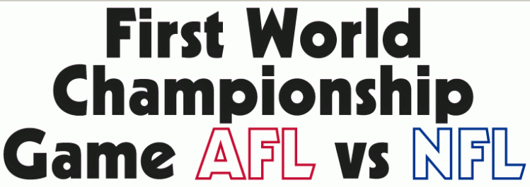
26. Super Bowl I
Fifty-one years ago no one could have imagined how big this one game would become. Not just on the field, but off with the integration of pop culture in the halftime show, to the amount of money spent by corporations and fans. The first Super Bowl “logo” was merely a handful of words: First World Championship Game AFL vs NFL.
A black font for the first couple of words, followed by white for the leagues with their respective colors bordering it. The design was simple, crisp, and clean. You can not get much better than those three things in a design, and the NFL and the designer did a great job incorporating theme in with no precedent.
26 Jan 2001: The logo for Super Bowl XXXV is displayed alongside the logos of the Baltimore Ravens and the New York Giants outside Raymond James Stadium in Tampa, Florida. The Baltimore Ravens will face the New York Giants in Super Bowl XXXV. DIGITAL IMAGE. Mandatory Credit: Tom Hauck/ALLSPORT
25. Super Bowl XXXV
I’m still not completely sold on this logo, but you have to admire the design as a whole. The words Super Bowl are displayed nicely and are easily found in the middle of the logo. I wish the roman numerals weren’t hidden as much, but the crest overlay is nice enough that it does not take away from the whole idea of the game. The league stepped away from the traditional red, white, and blue colors but these work for the location.
PASADENA, CA – JANUARY 9: John Madden head coach for the Oakland Raiders picked up by his team after winning Super Bowl XI against the Minnesota Vikings at the Rose Bowl on January 9, 1977 in Pasadena, California. The Raiders defeated the Vikings 32-14. (Photo by Focus On Sport/Getty Images)
24. Super Bowl XI
Red, white, and blue returns to the Super Bowl logo. Like many of the early designs, there was little mention of the host city or teams involved. It was simply the league and the two sides that were playing in it. AFC red and NFC blue were all that was needed for yet another clean logo.
My only complaint is that the roman numerals are larger than the letters, but at the same time you can not blame them for wanting it to stick out.
MIAMI GARDENS, FL – FEBRUARY 4: Indianapolis Colts coach Tony Dungy holds the Super Bowl Trophy following the game against the Chicago Bears at Super Bowl XLI on February 4, 2007 at Dolphin Stadium in Miami Gardens, Florida. The Colts won 29-17. (Photo by Michael Zagaris/Getty Images)
23. Super Bowl XLI
Peyton Manning’s first Super Bowl logo was admittedly a bit cartoony, but the colors worked with the game. This is the first game where the logo designer used the letter I as a pylon, and it worked well. The league also kept the “XL” theme they had used before by making sure the numerals were prominent, while not taking away from the Super Bowl banner. The glare at the top was a nice, subtle tribute to the game being played in Florida, and the football against the I/pylon was also a good addition. Cartoony, but the whole thing works within itself.
UNITED STATES – JANUARY 18: Football: Super Bowl X, Pittsburgh Steelers Lynn Swann (88) in action vs Dallas Cowboys, Miami, FL 1/18/1976 (Photo by Heinz Kluetmeier/Sports Illustrated/Getty Images) (SetNumber: X20183)
22. Super Bowl X
Super Bowl X could have been promoted in so many ways, but I like the basic design the league went with. The unique font went on to be used several more times by the league for their Super Bowl logos, and it’s a very sleek design. Nothing fancy, just the game. It’s the Bill Belichick of Super Bowl logos; it does its job, while being just a hair different. Certainly nothing wrong with that, especially when it continues to win over and over again.
Feb 8, 2016; San Francisco, CA, USA; General view of Super Bowl LI logo during press conference at the Moscone Center. Mandatory Credit: Kirby Lee-USA TODAY Sports
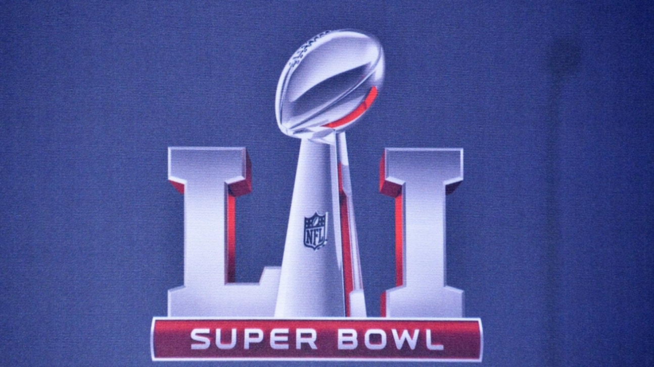
21. Super Bowl LI
This year’s logo finally makes an appearance after the NFL brought back the roman numerals. It was understandable why they avoided having “Super Bowl L” simply because of the mocking it was taking early on. Going back to the roman numerals was needed, and the league was smart to incorporate it.
Unlike logos in years past, this year does not include the home stadium or anything really related to the host city. I like the league and designer going in a different direction from the generic late-40’s Super Bowl logos. This year’s logo is very sleek with the red reflection off the bold numerals and the Lombardi trophy standing resolutely between them. Well done, NFL
MIA MI, FL – January 14: The National Anthem is played before the start of Super Bowl II between the Green Bay Packer and Oakland Raiders January 14, 1968 at the Orange Bowl in Miami, Florida. The Packers won the game 33-14. (Photo by Focus on Sport/Getty Images)
20. Super Bowl II
The first year the championship is labeled the “Super Bowl” brings us this design. I like the red letters with the blue outline, and the font is unique but not outrageous. It could have come out like an elementary school project using ClipArt, but instead is an excellent start to one of the great American traditions. Green Bay would win its’ second straight “Super Bowl,” and the legend of Vince Lombardi grew across not just the sport, but the nation. Sometimes simple is better than elaborate, and the designer and leagues embraced that idea well.
30 January 2004: AEROSMITH posing after their press conference for the SUPER BOWL Pre-Game show of SUPER BOWL XXXVIII that was played at Reliant Stadium in Houston, Texas. Aerosmith is pictured from L to R Tom Hamilton, Steven Tyler, Joe Perry, Joey Kramer and Brad Whitford. (Photo by Cliff Welch/Icon Sportswire via Getty Images)
19. Super Bowl XXXVIII
This is a logo you either love or hate, and I side for the prior. With the Super Bowl and NFL coming to Houston the designer had little choice but to recognize Houston and the space program. The bend within the roman numeral ribbon is almost psychedelic, and the font combining the letters is very cool. The ring around the logo is reminiscent of Saturn, and the stars are too obvious to ignore. While the colors do wane from the traditional red, white, and blue the tribute to the city of Houston is understandable and respected. It’s creative and deserves credit for that.
NEW ORLEANS – JANUARY 16: Walt Garrison
18. Super Bowl VI
This logo for Super Bowl VI takes you back to the wild west, which is a coincidence since the Cowboys would win the big game. The curves and tails coming off each letter look like spurs, and the design as a whole looks like a free-swinging saloon door. It’s a very 1970’s approach but you have to love it.
As mentioned earlier, the Cowboys would ultimately come away with a victory led by Roger Staubach and coach Tom Landry against Don Shula’s Miami Dolphins. Dallas nearly shutout Shula’s Dolphins, winning 24-3 en route to the Cowboys’ first championship.
26 Jan 1997: Fans cheer and wave signs during Super Bowl XXXI between the Green Bay Packers and the New England Patriots at the Superdome in New Orleans, Louisiana. The Packers won the game, 35-21.
17. Super Bowl XXXI
You can not get any more “New Orleans” than this logo for Super Bowl XXXI. While I love the traditional three colors, I applaud the use of the purple, gold, and green as a tribute to the great city. Everything in New Orleans is the life of the party, and this design brings the party and spirit of the city to life. Looking like a court jester with the king’s crown, we are reminded that while the NFL is fun and exciting, it reigns supreme over all other sports and the Super Bowl does the same. It’s unique, but it works for the place and occasion.
NEW ORLEANS, LA – JANUARY 26: Kicker Tony Franklin
16. Super Bowl XX
The Super Bowl went back to the Superdome, where Mike Ditka and the Chicago Bears mauled New England by 36 points. I can not tell if this logo was designed to be for an airline, diner, or the Seattle Mariners. Whichever it was intended for, it worked great for the Super Bowl. We got back to the red, white and blue with sleek lines and prominent features. The numerals are not overwhelming, and the phrase Super Bowl is easily viewable. The ends of the look sharp enough to pierce you, again bringing back the 1950’s-esque theme.
TEMPE, AZ – JANUARY 28: Detail view of the Super Bowl XXX logo with Ford as an official sponsor displayed on a car door prior to the NFL Championship game between the Dallas Cowboys and the Pittsburgh Steelers at Sun Devil Stadium on January 28,1996 in Tempe, Arizona. The Cowboys defeated the Steelers 27-17. (Photo by George Rose/Getty Images)
15. Super Bowl XXX
Super Bowl XXX has a logo that certainly takes a bite out of the local flavor. Played in Tempe, Arizona the logo screams desert with the font and colors. While the colors work for the location, I’m not sure how they best work with the occasion.
The Super Bowl is a holiday and a star-studded red carpet event bundled into one package. The dark colors counter that feeling, and while they work for the area, they don’t work well for a primetime event. The Cowboys would ultimately defeat the Steelers in this one despite a late comeback attempt by Pittsburgh, resulting in a final score of 27-17.
TAMPA, FL – FEBRUARY 01: Team chairman Dan Rooney of the Pittsburgh Steelers receives the Superbowl trophy from Joe Namath and Commissioner Roger Goodell after defeating the Arizona Cardinals during Super Bowl XLIII on February 1, 2009 at Raymond James Stadium in Tampa, Florida. The Steelers defeated the Cardinals 27-23. (Photo by Michael Zagaris/Getty Images)
14. Super Bowl XLIII
The logo for Super Bowl XLIII looks as if it is rising out of the field, and looks great doing so. The designer avoided using all the letter I’s as pylons, which is fine. One pylon is good, three is just too many. Having the red and blue stars one each side representing each conference is once again a good addition. This is also the first and only time the Super Bowl logo included a football field. Hard to believe, but whoever designed the logo with the NFL was smart to finally bring the field back into play.
MIAMI, FL – JANUARY 17: Earl Morrall
13. Super Bowl V
Super Bowl V, also known as the Blunder Bowl thanks to 11 turnovers, brings a clean, simple design. With a balance of red, white, and blue the logo the crisp lines and smooth curves balance well. I would have liked to see the lines be a bit thicker, and something needs to be done with the “E” in Super. If the letter “L” is not one-hundred percent curves I am not sure why the “E” is not the same. It looks like someone took a bite out of the number eight.
Regardless, the logo is clean, simple, and a great representation for a game won in the final seconds thanks to a field goal.
DETROIT, MI – FEBRUARY 5: Ford Field during Super Bowl XL played between the Pittsburgh Steelers and The Seattle Seahawks at Ford Field in Detroit, Michigan. The Steelers defeated the Seahawks by a score of 21 to 10. (Photo by Rob Tringali/SportsChrome/Getty Images)
12. Super Bowl XL
The NFL embraced the extra-large theme with Super Bowl XL, making everything larger than life for a game that is just that. While they highlight the fact that it’s large and incharge, the simplicity wins the design. Basic red, white, and blue colors are the way to go with these logos sometimes, bringing together not just the idea that this is now America’s game, but the NFC, AFC, and the league coming together for one game. I also like how the font was presented prominently in the middle, and the stars bordering each end.
11. Super Bowl XLVIII
I purposefully ignored the recent Super Bowl logos, which have become fairly bland. The league looked lazy with the gray trophy with the stadium hardly recognizable. When you look at the logo for Super Bowl XLVIII you know where the team is playing. The designer worked in the New York skyline with the Empire State Building and Freedom Tower perfectly.
The roman numerals have good depth, as does the trophy. It was a much-needed change after years of unappealing, generic designs, and rightfully brought back the image of the host city. It just passed making the top-10 because it’s still a little too similar to the old versions.
ATLANTA, GA – JANUARY 30: Tight end Keith McKeller
10. Super Bowl XXVIII
As the Dallas Cowboys mounted a second-half comeback in the Georgia Dome they donned this sharp, colorful image in Super Bowl XXVIII. While the use of the peach is somewhat stereotypical for the location, the way the designer integrated it into the logo was perfect.
The combination of bright and dark blues with the white and orange makes this one of the better Super Bowl logos in terms of being aesthetically pleasing. Having the leaves overlay the ribbon was also well thought out. Eight future Hall of Famers would ultimately be represented in this game, which was won handily by the Cowboys, 30-13, over the Bills.
ATLANTA, UNITED STATES: US comedians Tom (L) and his brother Dick (R) Smothers address a press conference 28 January 2000 at the Georgia Dome in Atlanta, Georgia. The Smothers Brothers will host the pre-game show before the start of Super Bowl XXXIV at the Georgia Dome 30 January 2000. (ELECTRONIC IMAGE) AFP PHOTO/Tony RANZE (Photo credit should read TONY RANZE/AFP/Getty Images)
9. Super Bowl XXXIV
Super Bowl XXXIV was the first, and to this day only, Super Bowl logo to feature the NFL crest. Like many of the top 10 Super Bowl logos, this one is simple with all the right symbolism and colors. They work in the NFC blue and AFC red, while also representing the league with the shield. I know the year 2000 was a big deal, but was it really necessary to have it plastered that large on the bottom? Regardless, the word Super Bowl is the perfect size with great font, as are the roman numerals.
MIAMI, : NFL ground crew worker Pete Wozniak paints the field 30 January in preparation for Super Bowl XXXIII at Pro Player Stadium in Miami, Florida. The Denver Broncos will take on the Atlanta Falcons in the Super Bowl on 31 January. (ELECTRONIC IMAGE) AFP PHOTO/Robert SCHMIDT (Photo credit should read ROBERTO SCHMIDT/AFP/Getty Images)
8. Super Bowl XXXIII
Originally this logo looks to be for a game in Las Vegas, but we all know that isn’t going to happen, courtesy of Mark Davis. Like other logos this one captures some of the local flare for Miami. The reason Vegas is the first thing that comes to mind is because of the idea of it being a party or part of a theater marquee.
Of course, only Miami will rival a Vegas party, and the design represents that. I would have liked to see a little more blue or even a touch of red to recognize the AFC, but the logo does its job. Of course, the image of a marquee is fitting as John Elway walks into the sunset with another Super Bowl to his name.
NFL Football Super Bowl XXXIX – security Philadelphia Eagles against New England Patriots during Super Bowl 39 in Jacksonville, Fla, on Feb.6, 2005 at ALLTEL Stadium. The Patriots won 24-21. (Photo by Albert Dickson/Sporting News via Getty Images)
7. Super Bowl XXXIX
Once again the Super Bowl logo taps into the local feel of the host city, Jacksonville. Fans see waves ripple across the ocean, and the prominent bridge suspended overtop. Having the sun instead of the bridge may have fared a bit better with the ocean scene, but regardless it works.
The word Super Bowl is nicely placed in the middle, while not being overmatched by the roman numerals or images embedded around it. I especially like the font the designer put the roman numerals in, and the shading is also a nice touch.
Football: Super Bowl XIV: Pittsburgh Steelers Franco Harris (32) in action, rushing for touchdown vs Los Angeles Rams at Rose Bowl Stadium.
Pasadena, CA 1/20/1980
CREDIT: Tony Triolo (Photo by Tony Triolo /Sports Illustrated/Getty Images)
(Set Number: X24131 )
6. Super Bowl XIV
The original Los Angeles Rams had a virtual home field advantage when Super Bowl XIV was played in Pasadena. Despite taking a 19-17 lead into the fourth quarter, Los Angeles could not contain Steelers quarterback Terry Bradshaw, who threw for over 300 yards and two touchdowns.
The logo from Super Bowl XIV bears a resemblance of a 1950’s diner or the emblem on an original Chevrolet Bel Air. The font takes you back to the start of the NFL and the early era of professional football. Finally, the colors are a great representation of the NFC and AFC with the striking red and blue.
SAN DIEGO – JANUARY 26: Running back Mike Alstott
5. Super Bowl XXXVII
Super Bowl XXXVII captured the spirit of its host city San Diego in the logo very well in the “Gruden Bowl.” With the Tampa Bay Buccaneers playing Jon Gruden’s former Oakland Raiders, the nautical theme presented in the logo with the combination of sea blue, yellow, and white fit well together. The Old Point Loma lighthouse was a very nice feature in the logo as well. My only complaint would be how the lettering is arranged, but the theme and colors make up for it.
PASADENA, CA – JANUARY 31: Jets fly over the stadium during the National Anthem before Super Bowl XXVII between the Dallas Cowboys and Buffalo Bills at the Rose Bowl on January 31, 1993 in Pasadena, California. The Cowboys defeated the Bills 52-17. (Photo by Michael Zagaris/Getty Images)
4. Super Bowl XXVII
The designer for Super Bowl XXVII made sure to represent the fact that the game was played in the Rose Bowl, while not overdoing the theme. The singular blooming rose at the top was just enough not to be shoving the location down the viewer’s throat. The two roses on the side (at least to me) represent the NFC and AFC being on an even playing field, while the large one represents the blossoming league.
While the roman numerals are certainly well established, the words “Super Bowl” could have been slightly larger and more prominent. Ultimately it’s a great design that captures the area and the game, something few have done since.
MIAMI GARDENS, FL – FEBRUARY 07: Quarterback Drew Brees
3. Super Bowl XLIV
Drew Brees and his son look out over the confetti with the Super Bowl XLIV logo underneath them. The designer of this logo got extremely creative, something we have not seen in recent years. Sneaking in the field goal posts between the L and I was impressive, and the color matching the pylon was a great touch.
Between the font, somewhat hidden features, and color, there is not much to not like about this logo. My only note is the word Super Bowl may have fit better in large block letters on top or underneath the roman numerals. Other than that, it’s a great representation of the game.
NEW ORLEANS, UNITED STATES: A banner announcing the Super Bowl XXXV hangs at The Louisiana Superdome in New Orleans 29 January, 2002. The AFC Champions New England Patriots will take on the NFC Champions St. Louis Rams in Super Bowl XXXVI on 03 February. AFP PHOTO/Jeff HAYNES (Photo credit should read JEFF HAYNES/AFP/Getty Images)
2. Super Bowl XXXVI
For more ways than one, Super Bowl XXXVI was a monumental event in not just the history of the NFL but for the United States. Played four months after the September 11th attacks in New York City, Virginia, and Pennsylvania rocked the country, football was there to help heal. The league scrapped the original Super Bowl XXXVI logo in the wake of the attack and had the above image created. No longer was the game about the Patriots, Rams, or even football in general. It was about healing a country in pain.
SAN FRANCISCO, CA – FEBRUARY 03: Detailed view of a Super Bowl 50 logo stitched on a Denver Broncos uniform during the NFL Experience exhibition before Super Bowl 50 at the Moscone Center on February 3, 2016 in San Francisco, California. (Photo by Jason O. Watson/Getty Images)
1. Super Bowl 50
Out with the old, and finally in with the new! After the bland image of the Lombardi trophy squished together with roman numerals and a gray stadium was used for years, the NFL went all out for their golden anniversary. Having the golden 50 instead of the simple roman numeral “L” was a smart marketing ploy.
Having the Golden Gate Bridge silhouette was a subtle but game-changing touch added by the designer. Hopefully, this logo sets a new precedent for the game going forward. Adding a color other than gray/silver should be a new requirement for the logo going forward. Bringing back the local flavor through the colors wouldn’t hurt at all.
More from FanSided
This article originally appeared on ![]()
2024 NFL predictions: An early look at division winners
2024 NFL Power Rankings: A post-draft look at where every team stands
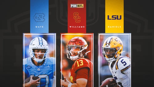
2024 NFL Draft QB rankings: Caleb Williams leads top 10 prospects
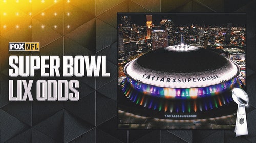
2025 Super Bowl LIX odds: All is quiet as league awaits schedule release
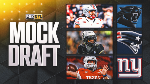
2025 NFL mock draft: Who are next year's top prospects
2024 NFL Draft order: Updated after Round 1
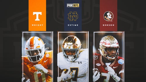
2024 NFL Draft RB rankings: No clear stars, but deep top 10 prospects
NFC South schedule preview: Breaking down the division’s 2024 opponents
2024 NFL Draft grades: Analyzing all 32 teams' classes; Who gets top marks?
-
2024 NFL predictions: An early look at division winners
2024 NFL Power Rankings: A post-draft look at where every team stands
2024 NFL Draft QB rankings: Caleb Williams leads top 10 prospects
-
2025 Super Bowl LIX odds: All is quiet as league awaits schedule release
2025 NFL mock draft: Who are next year's top prospects
2024 NFL Draft order: Updated after Round 1
-
2024 NFL Draft RB rankings: No clear stars, but deep top 10 prospects
NFC South schedule preview: Breaking down the division’s 2024 opponents
2024 NFL Draft grades: Analyzing all 32 teams' classes; Who gets top marks?