


Minor League Baseball Teams Poke Fun at New Los Angeles Chargers Logo
The Los Angeles Chargers unveiled their new home and a new logo to go along with the new era of football. Minor League Baseball teams took notice.
Big news came out of the National Football League this week when it was announced the San Diego Chargers were moving to Los Angeles. While a team moving like that is quite big news, what became a story along with it was the logo the Los Angeles Chargers unveiled, which will help bring in the new era of Chargers football. The logo has been panned all over social media, but the best digs came from Minor League Baseball teams.
Teams from across the country and classes of Minor League Baseball started posting their newly updated logos featuring the two knocks on the new Chargers logo: the lightning bolt and the incredible resemblance to another team’s logo. Here are a few of the gems that came out of their social media accounts.
The Electric Rebranding
We're not ones to fall behind the times. pic.twitter.com/IUuKvO2KUk
— Montgomery Biscuits (@BiscuitBaseball) January 12, 2017
The Montgomery Biscuits made a subtle change to their logo with a lightning bolt at the end of their “M”. It sure energizes their logo and gives the Biscuits a little more excitement.
Hey @Dbacks, you like our new logo? pic.twitter.com/5MM7lvSsbZ
— Reno Aces (@Aces) January 12, 2017
The Reno Aces approached it from a different angle by using their parent club’s, the Arizona Diamondbacks, primary “A” logo. It’s kind of like what the Chargers did with the Los Angeles Dodgers logo. It’s not as obvious of a jab, but it definitely gets the job done.
Ya know, you try to do something fun on social media & it just turns into something Harry Potter related…Can't say we didn't try #chargers pic.twitter.com/VJm7IQ6PFK
— MV Scrappers (@mvscrappers) January 12, 2017
The Short Season A affiliate of the Indians, the Mahoning Valley Scrappers, joined in on the fun also. They gave their logo some extra flare by essentially sorting their mascot, Scrappy, into Gryffindor by putting a lightning bolt on his forehead. While killing two birds with one stone, the Scrappers were able to get with the times in which the Chargers have started while at the same time producing something any “Potterhead” will love.
.@BiscuitBaseball We've been sitting on these bolts since '08 #Chargers pic.twitter.com/coqsaZzVNG
— Fresno Grizzlies (@FresnoGrizzlies) January 12, 2017
While many teams decided they would add lightning bolts to their logos, there were teams that wanted to point out that they have been ahead of the curve for years. The Fresno Grizzlies humbly pointed out to the Biscuits and the whole world of Twitter that they have had bolts in their logo since 2008. Being nine years ahead of the curve is quite impressive.
@FOXSports @MLBONFOX @MiLB and some already had 'em! #AheadOfTheCurve pic.twitter.com/8CjMKoE63E
— Omaha Storm Chasers (@OMAStormChasers) January 13, 2017
And we can’t forget the Omaha Stormchasers. They, too, were ahead of the lightning bolt curve that the Chargers thought they started.
The Adjustment
The Chargers have since responded to the criticism. They have changed the colors of their logo to distinguish the difference between them and the Dodgers.
New Chargers logo has been adjusted. Team displaying updated version with powder blue, yellow. pic.twitter.com/fUcRfF1JnS
— Michael Gehlken (@sdutGehlken) January 13, 2017
That doesn’t stop people from finding a way to mock it, though.
Chargers changed the colors of their logo? In that case… pic.twitter.com/wX62f7lFUi
— NFL Memes (@NFL_Memes) January 13, 2017
More from Call to the Pen
But hey, at least the Chargers tried. We will hope the product on the field will be better than the logo representing the team.
2024 NFL mock draft: Michael Penix Jr. rises, Brock Bowers cracks top 10
2024 NFL Draft Date, Time: Schedule, how to watch, TV channel
2024 NFL Draft order: Updated after Round 1
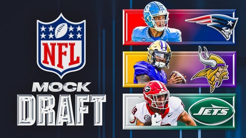
2024 NFL Draft: 6 QBs go in top 13, Jets trade up in Joel Klatt's mock draft
2024 NFL Draft prospect rankings: Top 100 led by Caleb Williams
2024 NFL Draft WR rankings: Marvin Harrison Jr. leads stacked top 10 prospects
2024 NFL Draft RB rankings: No clear stars, but deep top 10 prospects
2024 NFL Draft OT rankings: Scouting the best tackle class in 20-plus years
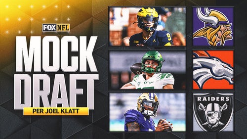
2024 NFL Draft: 5 QBs drafted, Jets add Bowers in Nick Wright's final mock draft
-
2024 NFL mock draft: Michael Penix Jr. rises, Brock Bowers cracks top 10
2024 NFL Draft Date, Time: Schedule, how to watch, TV channel
2024 NFL Draft order: Updated after Round 1
-
2024 NFL Draft: 6 QBs go in top 13, Jets trade up in Joel Klatt's mock draft
2024 NFL Draft prospect rankings: Top 100 led by Caleb Williams
2024 NFL Draft WR rankings: Marvin Harrison Jr. leads stacked top 10 prospects
-
2024 NFL Draft RB rankings: No clear stars, but deep top 10 prospects
2024 NFL Draft OT rankings: Scouting the best tackle class in 20-plus years
2024 NFL Draft: 5 QBs drafted, Jets add Bowers in Nick Wright's final mock draft