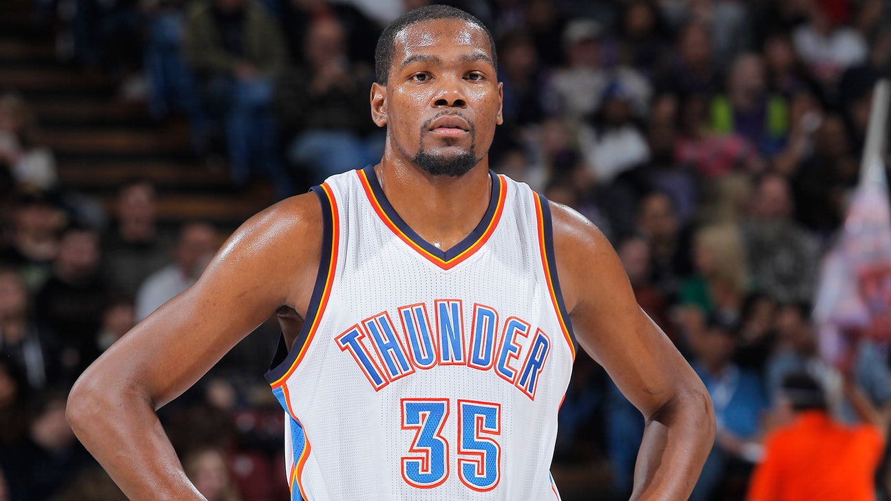
Do the Thunder have the worst logo in the NBA?

Well, according to Grantland's Zach Lowe, they do.
Lowe shared his definitive NBA team logo rankings on Tuesday, and the Oklahoma City Thunder ranked dead last.
Here's what Lowe had to say about the Thunder logo:
"No team has worse art, top to bottom, and Nike will push for an overhaul once it replaces Adidas as the league’s apparel partner in 2017. Nike and the Thunder are already talking, and the Thunder 'haven’t ruled out' a more explicit weather-related secondary mark, Byrnes says."
Brian Byrnes, the team’s senior vice-president for sales and marketing, said the Thunder wanted to go with either storms or raging bison with their original logo, but they "didn’t want to commit visually in either direction."
"We didn’t feel like having professional players represented by [an] animal was where we wanted to be,” Byrnes said. "... the bull was already taken."
According to Lowe, the Thunder are considering tweaking their primary design, but aren't likely to overhaul their colorway or logo.
"To some extent, we are committed to the idea we have," Byrnes says. "But we would not dismiss good feedback, particularly from Nike. We’re open to modernizing the logo, but we don’t have an appetite to overhaul it."
(h/t Grantland)
2025 NBA Playoff Picture, Bracket, Standings
NBA Champions by Year: Complete list of NBA Finals winners

2025 NBA Power Rankings: How far will Mavericks fall?
2025 NBA Playoffs Schedule: How to watch NBA Finals, TV, streaming, free
2024-25 NBA conference title odds: Which teams will make the NBA Finals?

2024-25 NBA MVP odds: SGA favored over Jokić in two-man race

Luka Dončić, Kevin Durant top 10 all-time biggest NBA trade deadline moves

-
2025 NBA Playoff Picture, Bracket, Standings
NBA Champions by Year: Complete list of NBA Finals winners
2025 NBA Power Rankings: How far will Mavericks fall?
-
2025 NBA Playoffs Schedule: How to watch NBA Finals, TV, streaming, free
2024-25 NBA conference title odds: Which teams will make the NBA Finals?
2024-25 NBA MVP odds: SGA favored over Jokić in two-man race
-
Luka Dončić, Kevin Durant top 10 all-time biggest NBA trade deadline moves