

Ever since they changed the logo game in the 1990s, the Phoenix Suns have been an aesthetically-pleasing bunch on the court. But when the team recently transitioned from its purplish-blue and orange logo scheme to one that emphasized black and orange, things didn't necessarily improve for the team, at least in the eyes of one prominent national writer.
Grantland's Zach Lowe writes that the Suns' mark should be a "no-brainer top-10" logo, but the change in color scheme has knocked the team's shield into the bottom half of the league for Lowe:
The sunburst should be a no-brainer top-10 mark, but the Suns have imprisoned it within a black jail cell. Either let that baby soar without boundaries, or go back to the purple-blue background that set the league on fire in the mid-1990s.
Black has served as a nice accent for the Suns through the years, and their Charles Barkley-era black alternate jerseys might be the best uniforms the team has ever worn. But by adopting black as one of the major team colors, Lowe argues that Phoenix lost a little bit of what made the team unique. Now, even their secondary logo looks like something the Miami Heat might have considered, Lowe writes.
(h/t Grantland)

2025 NBA Playoff Picture, Bracket, Standings
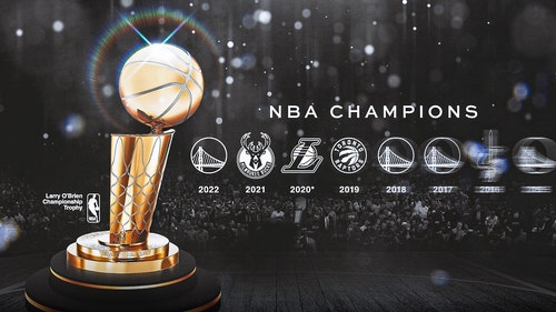
NBA Champions by Year: Complete list of NBA Finals winners

2025 NBA Playoffs Schedule: How to watch NBA Finals, TV, streaming, free

Kevin Durant reveals why he turned down Warriors return: 'I didn't want to move'

Luka Dončić, Kevin Durant top 10 all-time biggest NBA trade deadline moves

Rockets, Spurs top best Kevin Durant trade partners in potential Suns swap


-
2025 NBA Playoff Picture, Bracket, Standings
NBA Champions by Year: Complete list of NBA Finals winners
2025 NBA Playoffs Schedule: How to watch NBA Finals, TV, streaming, free
-
Kevin Durant reveals why he turned down Warriors return: 'I didn't want to move'
Luka Dončić, Kevin Durant top 10 all-time biggest NBA trade deadline moves
Rockets, Spurs top best Kevin Durant trade partners in potential Suns swap