


ADVERTISEMENT
LIVE NOW

FEATURED STORIES
MORE NFL NEWS
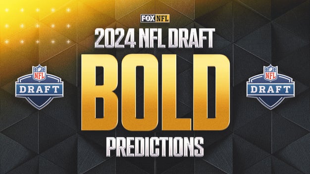
5 Bold Predictions for 2024 NFL Draft: Texas DT Byron Murphy a top-10 pick
1 DAY AGO • FOX SPORTS
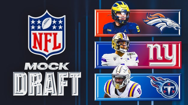
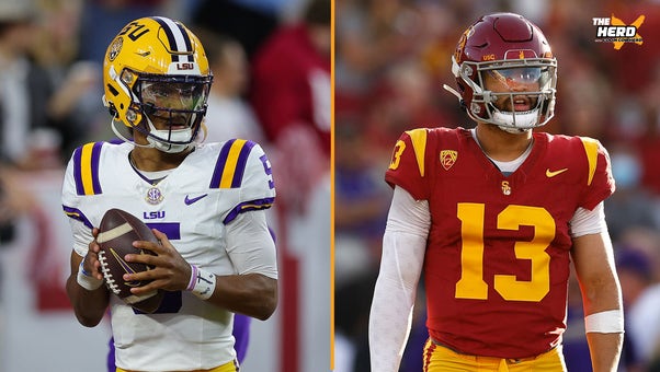
2024 NFL mock draft: 4 QBs in top 5, 4 receivers in first 10 picks
1 DAY AGO • FOX SPORTS
2024 New NFL uniforms: Texans unveil redesign, new secondary logo
1 DAY AGO • FOX SPORTS
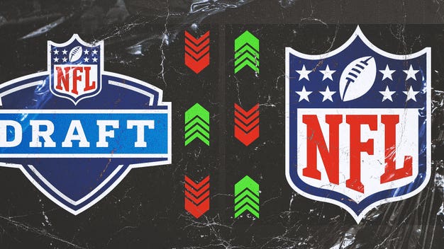
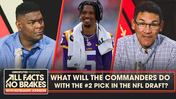
The art of NFL Draft misdirection: How teams use subterfuge to hide their plans
6 DAYS AGO • FOX SPORTS

FEATURED STORIES
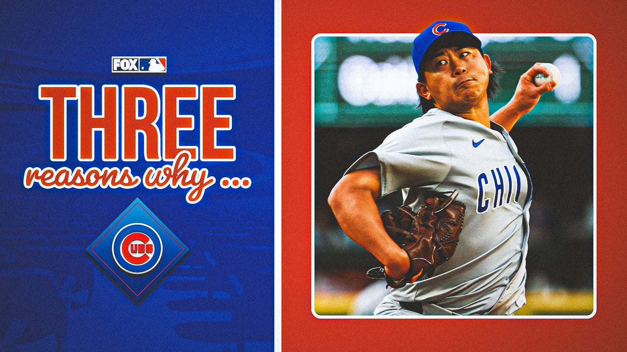
MORE MLB NEWSThree reasons why Cubs' Shōta Imanaga might be biggest steal from free agency
MLB progress report: 1 early flaw with each of baseball's best teams
2 DAYS AGO • FOX SPORTS
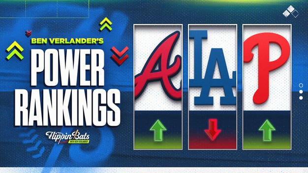
2024 MLB Power Rankings: Who deserves No. 1 spot as Dodgers tumble?
2 DAYS AGO • FOX SPORTS
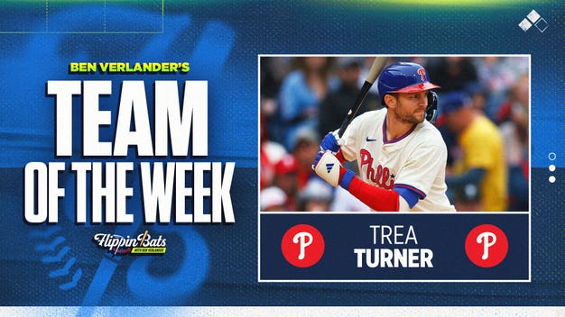
Trea Turner, Juan Soto headline Ben Verlander's Team of the Week
2 DAYS AGO • FOX SPORTS
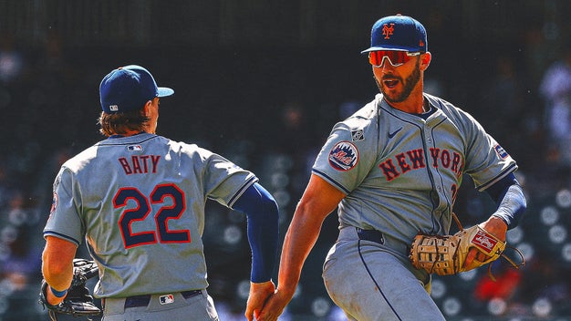
Inside the Mets’ stunning turnaround from an 0-5 start
5 DAYS AGO • FOX SPORTS


FEATURED STORIES
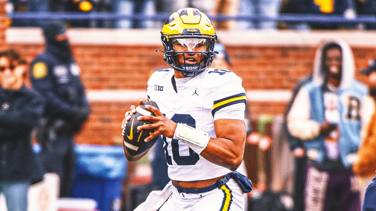
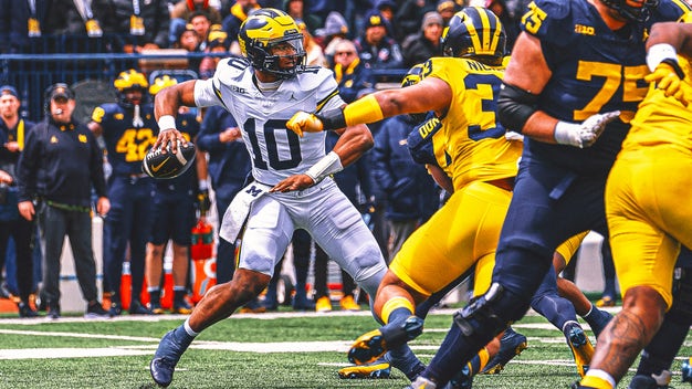
MORE COLLEGE FOOTBALL NEWSMichigan's Alex Orji embodies demeanor of starting QB; will it translate to wins?
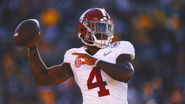
Can Alabama QB Jalen Milroe make a jump in 2024?
1 DAY AGO • FOX SPORTS
Michigan to host Texas in Week 2 on FOX: Is there a talent gap between the two teams?
4 DAYS AGO • FOX SPORTS
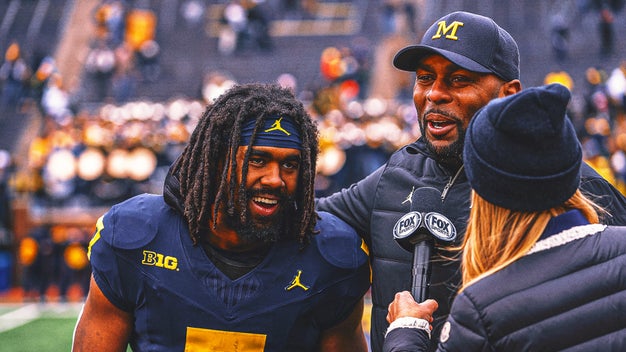
Michigan spring game takeaways: Donovan Edwards' year to shine
4 DAYS AGO • FOX SPORTS
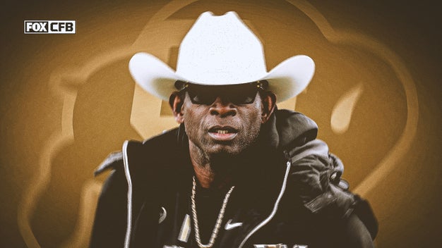
Do Deion Sanders, Colorado have a target on their backs heading into 2024 season?
5 DAYS AGO • FOX SPORTS
COLLEGE FOOTBALL VIDEOS
MORE COLLEGE FOOTBALL VIDEOS
3 HOURS AGO

4 HOURS AGO

4 HOURS AGO


FEATURED STORIES
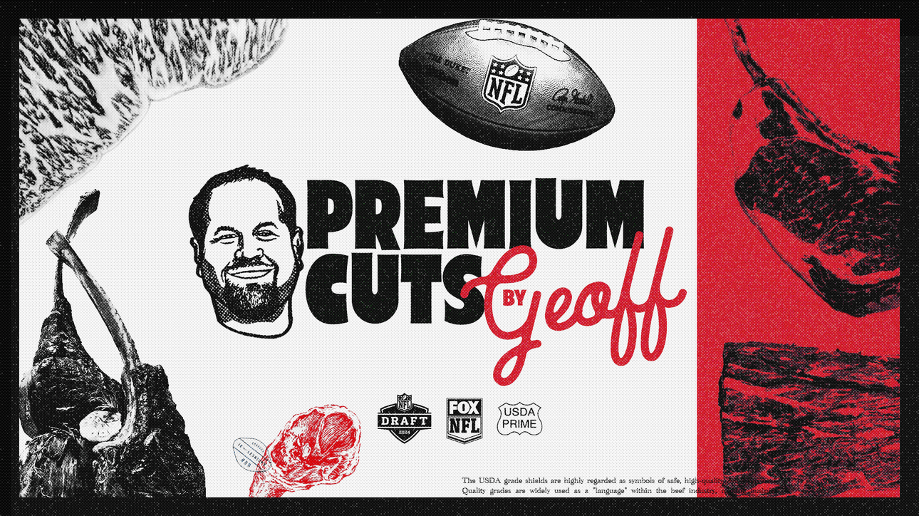
MORE ODDS NEWSPremium Cuts: 'Grading' the NFL Draft's prime prospects
2024 NFL Draft best bets and odds
2 HOURS AGO • FOX SPORTS
Sportsbooks brace for NFL Draft betting: 'It’s an impossible task'
2 DAYS AGO • FOX SPORTS
2024 NFL Draft odds: Chargers' odds to pick J.J. McCarthy rise on draft eve
6 HOURS AGO • FOX SPORTS
2024 NFL Draft odds: Five draft special bets being offered
6 HOURS AGO • FOX SPORTS


Trending Videos


PERSONALIZED NEWSLETTER

Sign up for exclusive news, updates, and stats for your favorite players, teams, and leagues!